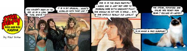
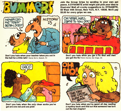
this style of illustration used to creep me out when I was a kid & I remember not liking "Bummers" much. The cartoons just look ugly, lumpy and dirty in a wierd way, it freaked me out then and it freaks me out now. Except now its tinged with nostalgia.
something i was noticing after i scanned them in is how very blotchy the black people are... i should try to see if the name of that illustrator is listed anywhere in the magazine, i recall he did other things besides Dynamite at that time too (like maybe hallmark cards or something?)
but perhaps it was not a spate, but rather just this guy? forgot to check the dynamite masthead last night to see... there was a general jerky/bumpy illustrative trend, so it wasn't ALL this one guy, but the specific way he does his lettering and stuff I know I've seen in other contexts and it was probably the same guy - not like he was just making a living off Bummers. your mention of Mad actually reminds me of something similar - I never read Mad, being more of a Cracked fan, and I remember looking in a Playboy or something and being shocked to discover that the dirty cartoons were often done by the same guys that did the kids cartoons in Cracked.

3 Comments:
this style of illustration used to creep me out when I was a kid & I remember not liking "Bummers" much. The cartoons just look ugly, lumpy and dirty in a wierd way, it freaked me out then and it freaks me out now. Except now its tinged with nostalgia.
something i was noticing after i scanned them in is how very blotchy the black people are... i should try to see if the name of that illustrator is listed anywhere in the magazine, i recall he did other things besides Dynamite at that time too (like maybe hallmark cards or something?)
but perhaps it was not a spate, but rather just this guy? forgot to check the dynamite masthead last night to see... there was a general jerky/bumpy illustrative trend, so it wasn't ALL this one guy, but the specific way he does his lettering and stuff I know I've seen in other contexts and it was probably the same guy - not like he was just making a living off Bummers. your mention of Mad actually reminds me of something similar - I never read Mad, being more of a Cracked fan, and I remember looking in a Playboy or something and being shocked to discover that the dirty cartoons were often done by the same guys that did the kids cartoons in Cracked.
Post a Comment
<< Home